Wine packaging has remained static over time. Customers have learned to expect the same glass bottle with a long neck and die-cut label. The primary goal of this packaging is to defy these expectations and bring anarchy to the wine aisle.
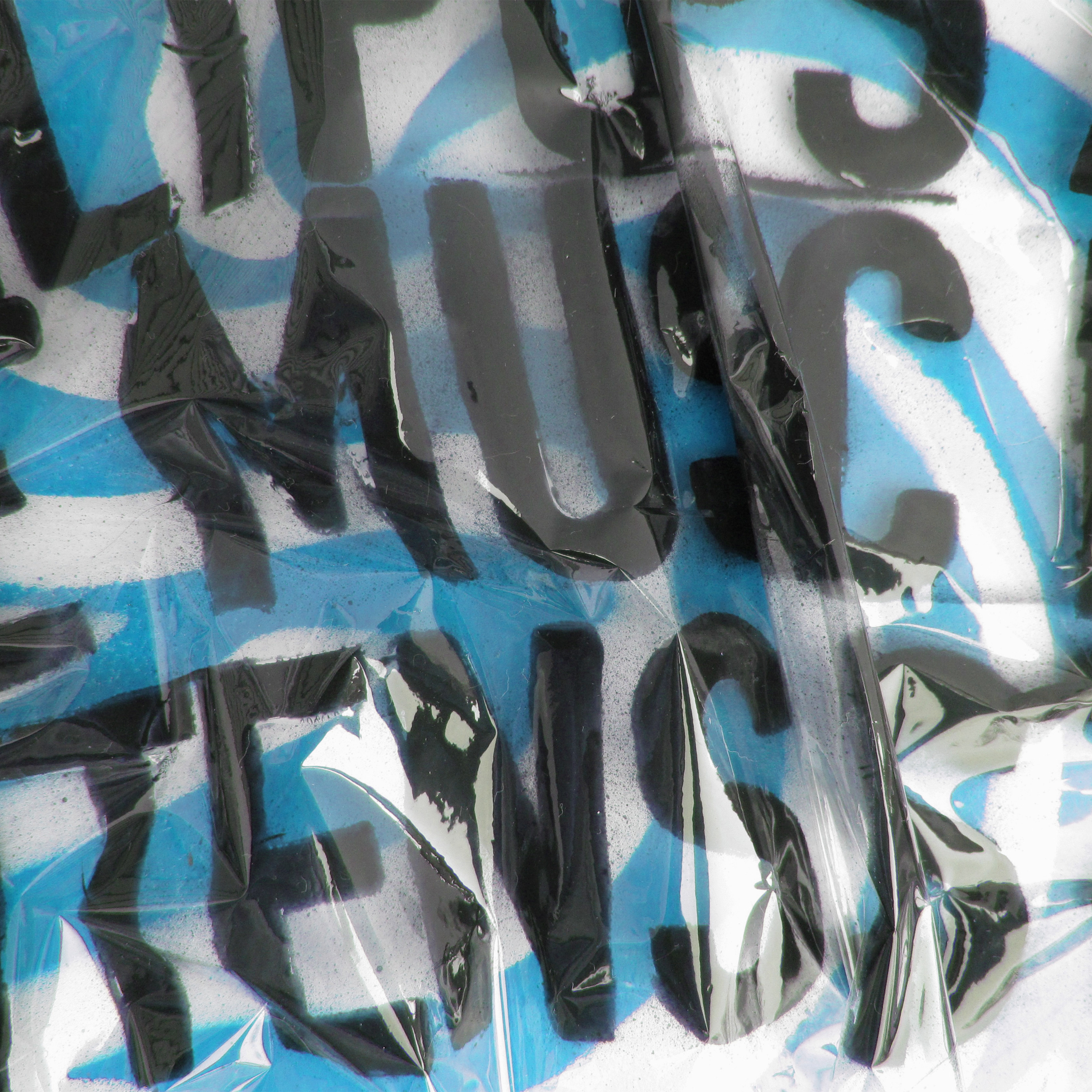
Anarchy Wine™ is a juxtaposition of the conservative 1900’s afternoon tea and modern rebellion. Because of this, the wine is housed in vintage pewter teapots that are covered in clashing imagery. The peeling floral wallpaper represents the aesthetic one might expect on a teapot from the early twentieth century. The punk fashion figures add the uncomfortable surprise that is common in rebellious imagery. The logo is spray painted in a bright neon color, a bold way to vandalize an object associated with the conservative upper class.


